Refreshing a brand that automates processes, so your people can ideate and deliver on what's next
Client: Nintex
Background
Nintex is a workflow automation company that wanted to increase their awareness in targeted industries and roles inside the businesses. Through studies conducted by previous agencies, they discovered that customers and current users had little to no brand loyalty to Nintex over competitors. They were also having issues demonstrating the value of the platform without facilitated conversations with a Nintex rep.
Goals
Early on it was identified that a rebrand was needed to set Nintex apart from the competition. This meant taking inventory of all their current assets, evaluating their relevance moving forward, creating net new experiences as needed, and ensuring a consistent brand voice going forward.
Challenge
Working with multiple teams inside and outside the business to get their requirements, buy in and support for the rollout of the brand is always taxing with a client that wants to move quickly. Amplifying existing brand equity needed to be top of mind in the team’s exploration as well.
Solution
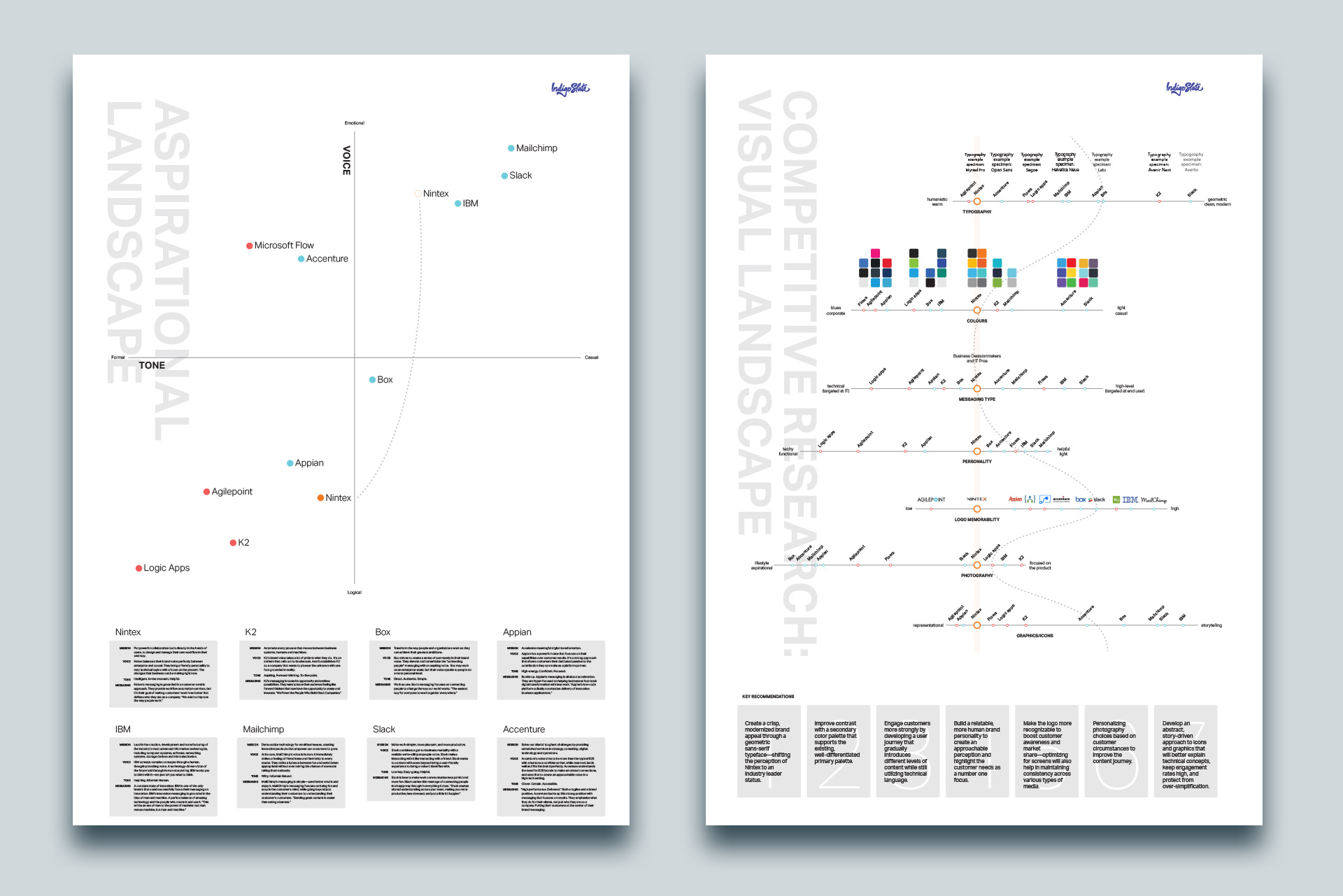
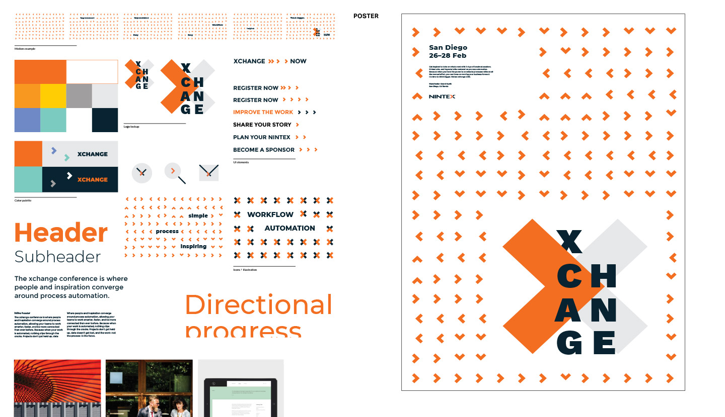
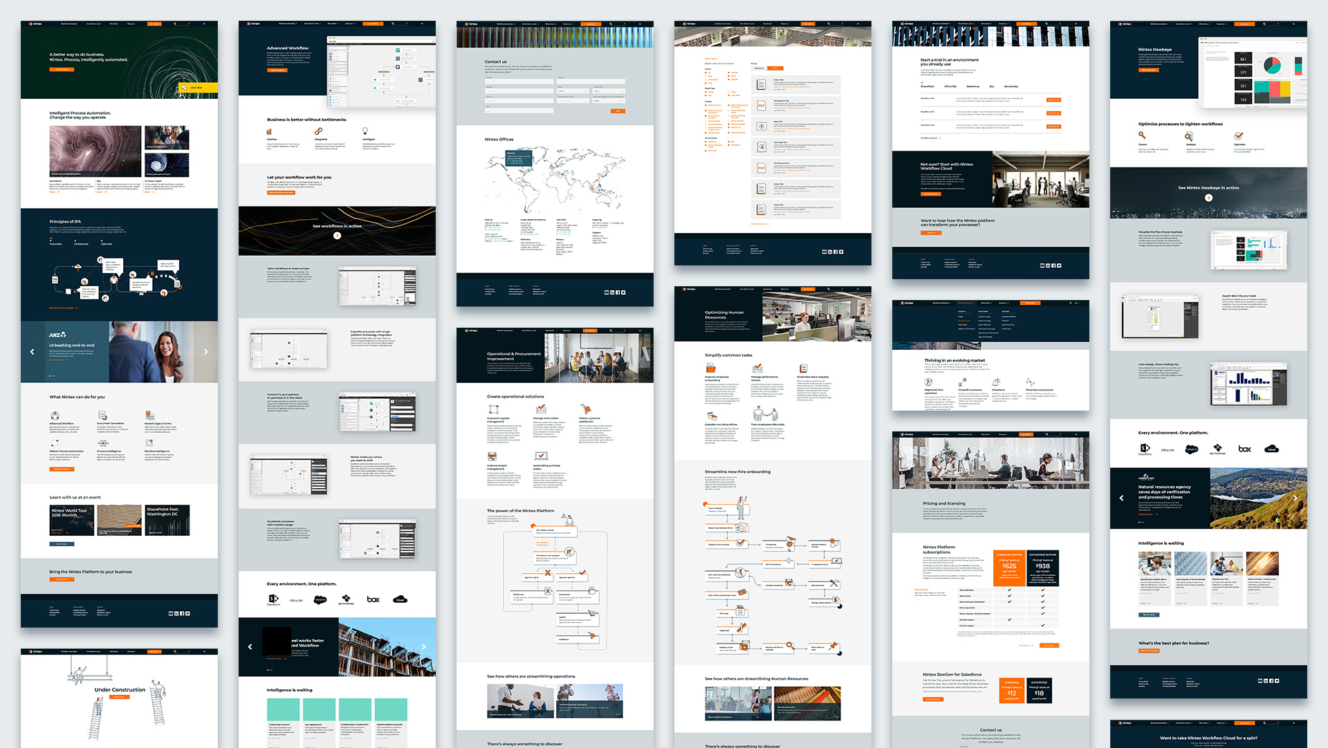
We created a strong brand that distinguished Nintex from the competition by creating a flexible system that accommodated different conversation types, distinct colour vocabulary that denoted an industry-leading platform, creating an expansive icon library, and reframing their logomark into a responsive modern context. We also handled the rollout of the brand rollout across multiple channels including their website, key demand gen assets, social
My role: Creative director
Team size: 9
Creative thinking applied: branding, visual systems, UI / UX, content marketing, print, environmental
Brand research and analysis
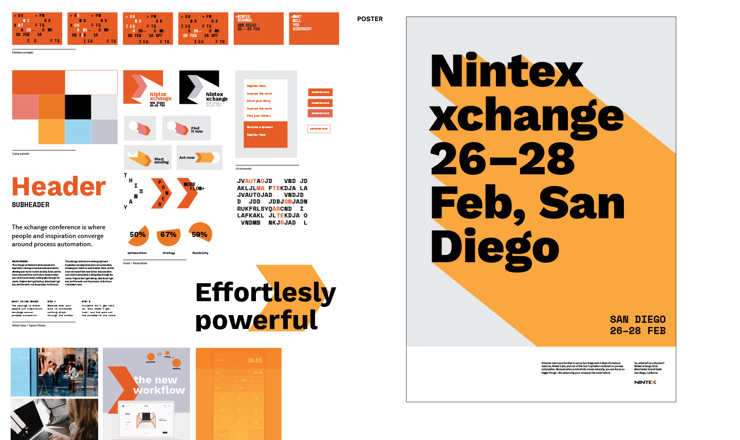
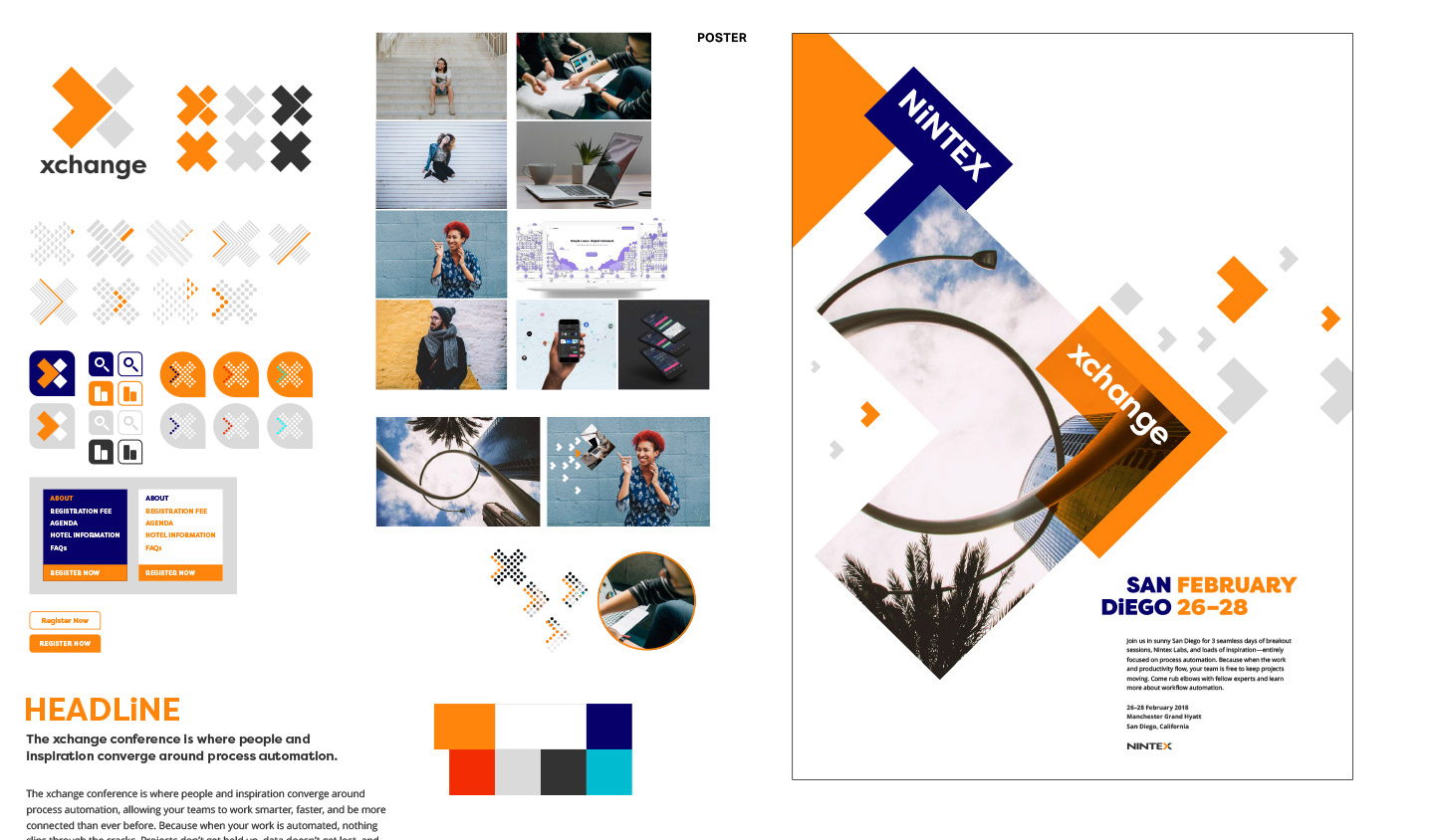
Brand exploration
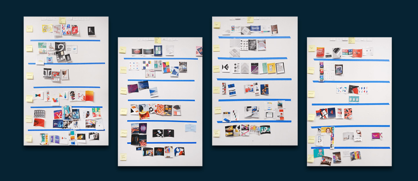
Chosen
Defining the brand
A responsive logo that can be used in every situation
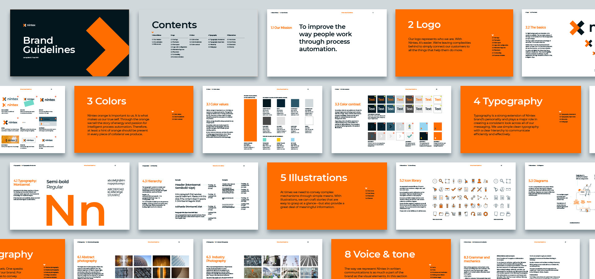
Applying the brand
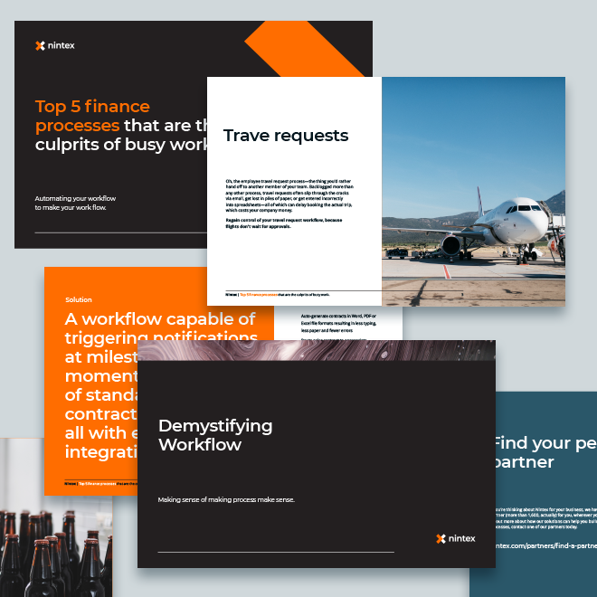
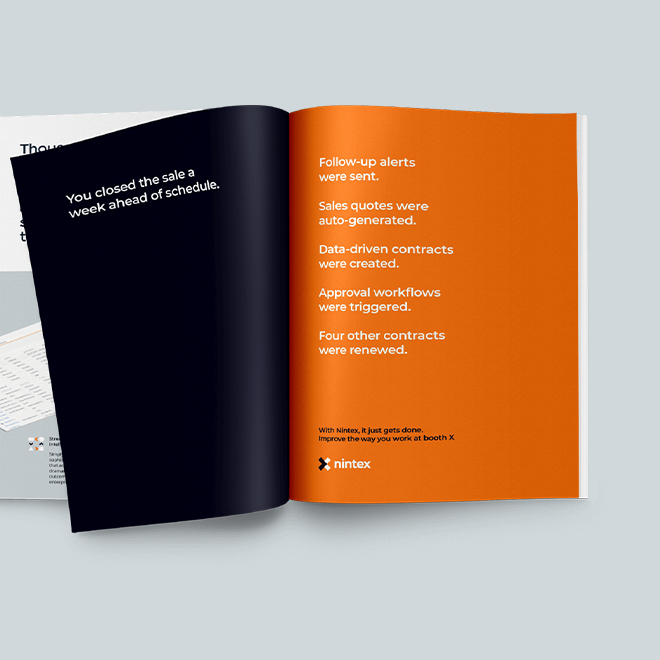
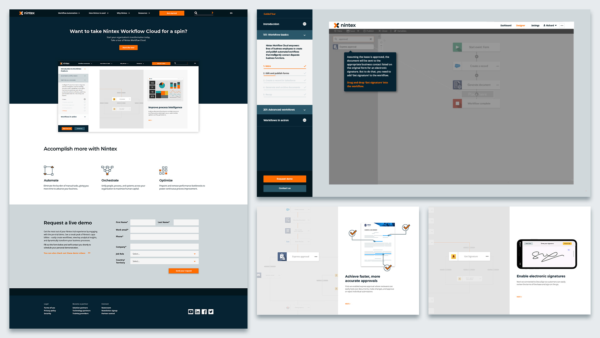
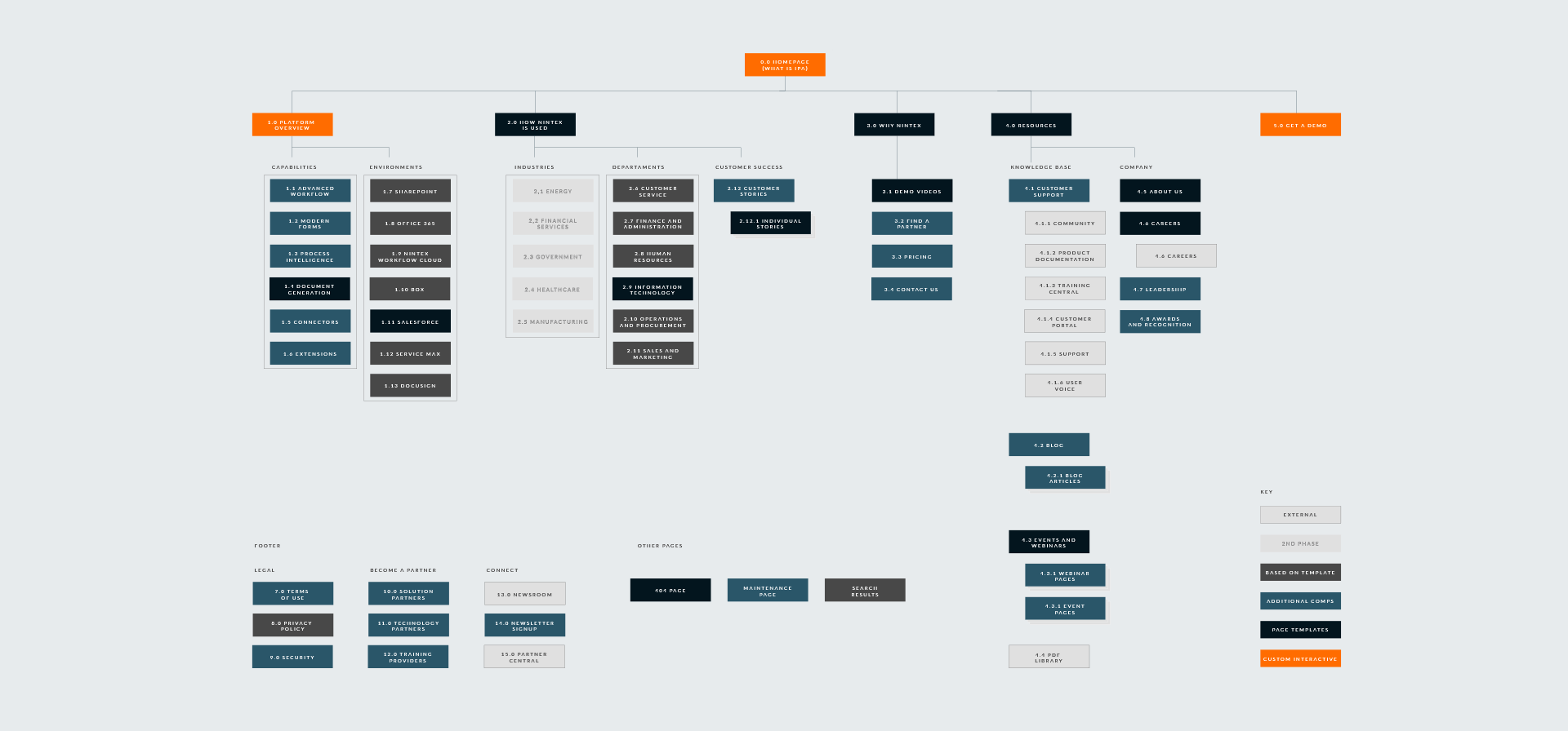
Redesigning and rewriting the content of their website
Creating a demo platform for users to see the product in use